
Several weeks ago, the remote for the monitor I use for my home computer died. Just the remote; not the monitor.
Ordinarily, this wouldn’t be a story worth telling. It was certainly an inconvenience but didn’t seem like it would be too aggravating of an issue at first. After all, I could simply manually turn the monitor on and off…right?
Well, that’s where this story took a frustrating turn.
The Missing Power Button
The monitor is one that I’ve owned for years—long enough that I have no idea where the manual got stashed or if I even still have it. I had already tried new batteries to no avail: the remote was definitely dead.
So, I looked for a power button on the monitor itself. I knew there were some buttons tucked around the right side of the bezel that I hadn’t ever used, so I assumed I’d find the power button there. But when I looked, all I saw were: Source, Menu, Volume Up/Down, and Channel Up/Down. No dedicated power button.
“One of these probably has a double function and also turns on the monitor,” I thought to myself. So, I pressed each in turn. But no luck. Hmm, “maybe a long press?” Still no luck. “Maybe a combo button press?” (Yes, I was grasping at straws at this point.) Still nothing.
I looked along the left side of the bezel and found only ports. Below the edge of the bezel? Nothing at all. And sure, it would be a weird spot for a power button, but maybe they stashed it along or behind the top edge of the bezel? Still nothing. And a quick glance at the back of the monitor didn’t reveal an obvious power button either.
So, naturally, I took to the internet. A few posts from other users assured me that there was always a power button on monitors from this manufacturer but warned that it might be “hidden”. So, this time, I pulled the monitor forward, grabbed a flashlight, and went about searching in earnest. But I found absolutely no visual or tactile indications of a power button anywhere on this darn thing.
By now, I was incredibly frustrated and beginning to ask myself whether this well-known manufacturer had actually put out a TV/monitor without a physical power button!
But I was also pretty dusty because that monitor hadn’t been moved in years. So, I grabbed a rag and went about wiping the whole thing down. At the same time, my spouse happened to grab the remote to try again… and the monitor turned on!
But then it wouldn’t turn off again. Because the remote was still definitely dead.
What the heck???
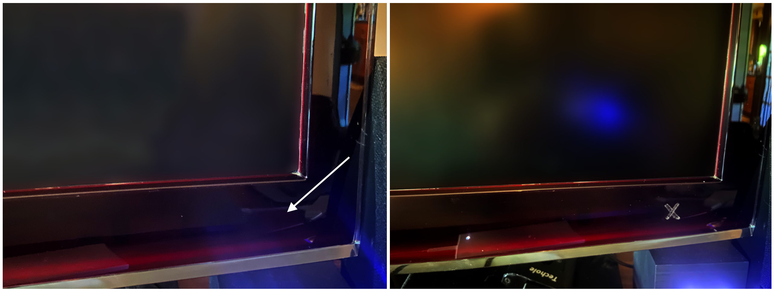
With the remote dead, the only explanation was that I had to have turned the monitor on while I was cleaning it. So, I went about experimenting, and eventually, I found it: a touch-sensitive power button on the front of the bezel near the bottom-right corner of the screen with absolutely no tactile or visual indications of any kind to indicate that it was there. Apparently, when I was cleaning the bezel, I dragged a finger across the right spot by complete chance.
The remote still isn’t working, which means the clandestine power button is the only way to turn that monitor on and off. But even knowing approximately where the button is located, it usually takes me multiple tries to tap the right spot. This eventually proved to be so annoying that recently, much to my spouse’s amusement, I marked the location with an X in permanent marker.
Is this an elegant workaround? Absolutely not. But the real question is: why did I need a workaround just to locate a power button in the first place?
Striking a Balance
As a usability expert and a UX designer, I’ve been asking myself how on earth this design came to be. I’d like to believe that the intention was NOT to have a completely hidden power button on this monitor, but it wouldn’t be the first time that usability was overlooked in favor of aesthetics.
There are a few other possibilities for how and why this could have happened. Perhaps there was a miscommunication between designers and engineers working in silos and the designer assumed (not unreasonably) that the power button would be one of the buttons along the side of the bezel. If that was the case, it highlights the importance of interdisciplinary teams or, at the very least, the benefits of good communication between those disciplines. Ensuring that design and engineering teams are on the same page can help prevent issues like these before a product ever goes to market.
Or perhaps the plan was to always have a front bezel power button and the designer had intended to differentiate it visually, but their design was overruled by an overzealous product manager. It certainly wouldn’t be the first time—all it takes is one stakeholder with enough sway, PM or otherwise, to rule in favor of aesthetics over usability in a way that negatively impacts the final product. It’s unfortunate, but not as uncommon as we might like.
Or perhaps this was the design plan all along? Perhaps the designers had a certain aesthetic in mind and felt strongly that labeling or differentiating the front bezel power button would somehow detract from that aesthetic. But now, as a result of that decision, I have a big X in permanent marker on the bezel and I doubt that’s the aesthetic the designers were going for. A scenario like this one highlights the importance of ensuring that your design team is made up of usability professionals as well as visual designers. If your designer’s role is visual design, he or she will likely give you a truly beautiful product—but gorgeous aesthetics don’t always translate to good usability. It is important—and arguably necessary—to ensure that both approaches are well-represented to ensure a well-rounded and effective design team.
Ideally, a successful product design will strike a balance between usability and aesthetics. While aesthetics are important for capturing attention and engaging users at the start, it is a product’s usability that will sustain interest and satisfaction in the long run. A visually appealing design may attract users at the start, but if users become frustrated and disengaged due to a lack of usability, the product is, ultimately, flawed. (Granted, in the case of the hidden power button, it took me several years to uncover this particular usability flaw—but given how easy it is to lose a remote, I was always just one careless misplaced remote away from being forced to confront the issue).
Usability and aesthetics should work together harmoniously. A well-designed product or design should not compromise core usability for the sake of aesthetics or vice versa. Instead, they should complement and reinforce each other from the very beginning of the design process to create a cohesive, meaningful, and enjoyable user experience. The case of the missing power button showcases just how valuable it is, both from a product design perspective and a sales perspective, to promote a working environment that prioritizes the expertise of skilled, interdisciplinary teams when bringing new designs to market.
At Daedalus, we understand that creating a seamless user experience means striking a delicate balance between aesthetics and usability. Our interdisciplinary teams work to craft designs that are both visually stunning and highly usable, resulting in products that engage and satisfy users in the long run.