
In addition to directing User Experience at Daedalus, I am also heavily involved in my local community. I recently attended a learning conference for municipal personnel and sat in on a session about best practices for mass communication with residents, via things like email, mailers, text messages, social media, and municipal web pages.
For the most part, the talk was interesting and informative, and the panelists even touched on accessibility, which I was delighted to hear. However, I was less delighted when one of the panelists said that he had begun to eliminate color from his communications due to concerns over color blindness.
I’ve had a couple of clients over the years make similar comments, and on the surface, you might think that it’s not a bad idea. Inclusive design is an admirable goal. But being inclusive means understanding the barriers that people face and removing those barriers; it does not mean removing stuff. Inclusive design does not mean deliberately removing useful design elements and creating a less usable experience for all of your users in order to accommodate users with disabilities, which is what this person’s proposal would have done.
To help you understand my reasoning, let’s consider another group of disabilities: hearing impairments. Obviously, we don’t want to exclude the deaf community or those who are hard of hearing.
When we design a webpage, then, should we eliminate all audio content? That would certainly be one way to ensure that no information is communicated only through audio channels. So, let’s say we eliminate the audio track for any videos that we post and replace it with captions that hearing-impaired users and most other users can read.
There you have it: by eliminating audio content, we’ve ensured that those with hearing impairments won’t be excluded. But, of course, now 100% of users are excluded from accessing audio content and we’ve also created new barriers for those with vision impairments. It’s a pretty ridiculous “solution”, isn’t it?
Obviously, eliminating all audio is not what accessible design would recommend. Rather, accessible design would recommend providing easy alternative access to the audio information. Instead of eliminating audio, the solution is to provide captions or transcripts for those with hearing impairments to ensure that there is another way for those individuals to access that information.
Far from removing useful content, we should turn our attention to ensuring that the content is presented in such a way that the highest number of people, regardless of disability, are able to engage with it.
It is exactly the same with color blindness!
Color Weakness
But before we go any further, I’d like to explain why the phrase color blindness is a misnomer.
For most people who are color blind, it is much more akin to being hard of hearing than it is to being deaf. Just as most hearing-impaired people can still hear to some extent, most people who have color blindness do still see color. But they have an altered perception of color, which can range from being very mild to quite severe. For this reason, I prefer to use phrases like color weakness or color deficiency when describing this type of disability.
Here’s an example: The last time my daughter’s Girl Scout Troop got together for a bonfire, we threw some chemical packets into the fire that turned the flames different colors and I captured the image below. If you have normal color vision, also called trichromacy, you should be able to see most of the colors of the rainbow in these flames.

However, if your color vision is not typical, the image above might look more like one of the ones below, depending on the type of color weakness you have:


As you can see, with the exception of true monochromacy, which is incredibly rare, those with color deficiencies can still see color. They just perceive color differently*.
Inclusive Design with Color
To create inclusive designs that account for color weaknesses, you need to ensure that color is never the only way that information is being communicated.
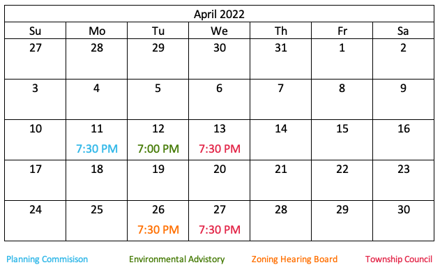
Let’s say that we wanted to create a community calendar that lists all the times and dates for the meetings of the various governing bodies. In this version of the calendar, the dates are color-coded to each group, but there is no other information on the calendar other than a legend to differentiate which meeting is for which group.
While people with normal color vision would easily be able to interpret this calendar, for people with red or green color weaknesses, the calendar above would look like this:
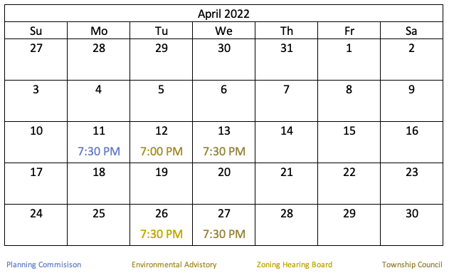
Notice that it is much more difficult to determine which governing bodies are meeting on the 12th, 13th, 26th, and 27th. That’s because for people with red and green color weaknesses, red, orange, and green can look very similar, especially when they are of a similar hue or saturation. In fact, the green and red in particular are close to indistinguishable here.
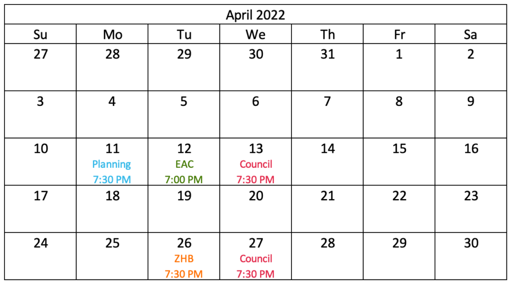
Effective accessible design in this case would mean presenting another way of conveying the information — in this case, which governing body is associated with each meeting. Providing a label for each, as in the calendar below, is not only good design, it is inclusive design because, for those with color deficiencies, the labels are what provide the necessary information. Color is still being used, but only as a secondary way to convey that same information.
But we don’t want to eliminate the use of color because, for those with normal color vision, the colors are a useful tool to help the user quickly find the meetings that he or she may be interested in.
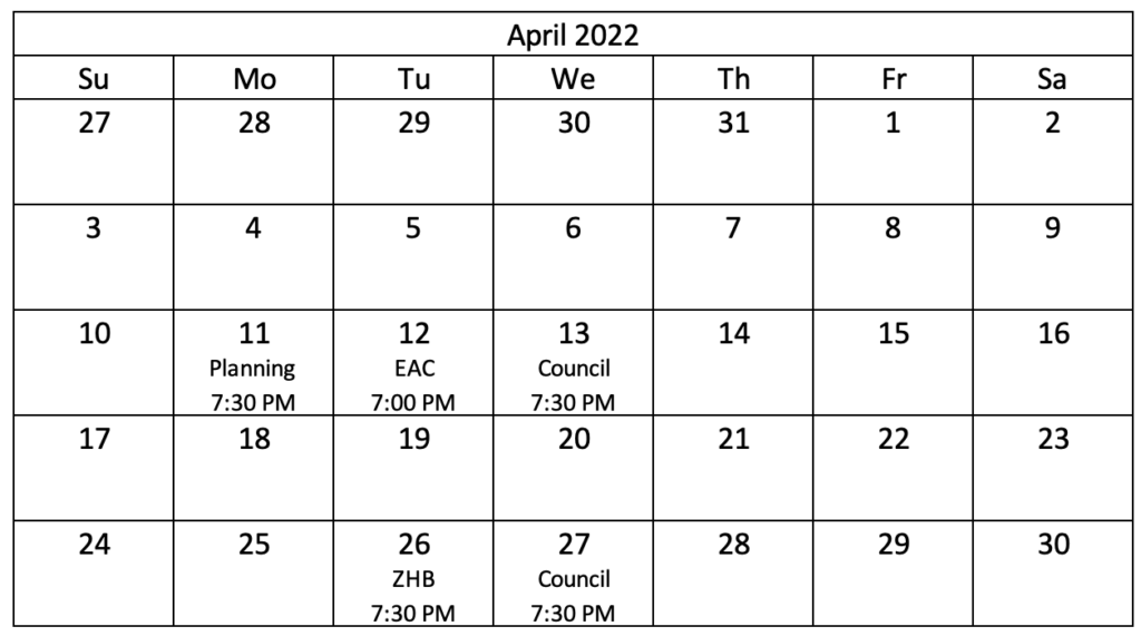
If we eliminate the use of color, like in the calendar depicted below, we would be taking away a useful feature from all of our users simply because 8-9% of people may not get the same level of use out of it — and we would also have a very boring calendar.
Creating inclusive and accessible design does not mean deliberately creating a lesser user experience for all users out of fear of excluding some users. It means being sensitive to and aware of what causes barriers for those user groups and coming up with design solutions that will more easily allow them to be included while still enhancing the overall experience for everyone.
* You have likely heard of red weaknesses and green weaknesses together being referred to as red-green blindness. Though they are separate disabilities caused by different mechanisms, as you can see, the results are quite similar, in that reds and greens appear to be shades of yellow, so they tend to be grouped together by most laypeople. Blue-yellow blindness is also a misnomer, as people with this condition tend to confuse blues with greens and yellows with violets (so blue-green blindness would be more accurate).