
“Deceptive UX”, or “Dark UX”, as it has also been called, is a concept that has gotten a bit of news coverage lately. So much in fact that earlier this year the Federal Trade Commission hosted a workshop on the topic, called “Bringing Dark Patterns to Light” and the AARP recently issued a cautionary article to their members about deceptive UX designs leading to unexpected monthly credit card charges.
I gave a talk about deceptive UX designs at Pittsburgh World AI Day 2018, titled “Designing with Wicked Intent” and given the recent kerfuffle, it seemed like a good time to revisit the topic.
What exactly are “deceptive UX” designs?
Before we talk about what deceptive UX designs are, let’s talk about what deceptive UX designs aren’t. While deceptive UX designs are certainly unethical, they aren’t necessarily bad designs. Bad designs fail to take into account the way that humans process information and as a result, they can cause us to make mistakes or it might take us longer to complete our task. These design shortcomings can be frustrating but are usually unintentional.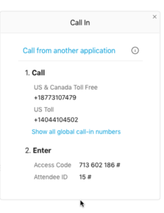
For example, to the right is a screen capture from a conferencing app that was used by one of our clients. The phone numbers that I was supposed to dial were each displayed as a single long string of numbers without the parsing typically seen for phone numbers.
That small bad design made it so much harder for me to remember the numbers as I was dialing in, and every time I did, it probably took me twice as long to dial the numbers as it should have. Not a big deal, and certainly not intended to confuse me or to cause me problems, but it was annoying all the same.
Deceptive UX designs are far more insidious. Deceptive designs use a keen understanding of human information processing and psychology to deliberately mislead you or to pressure you into making mistakes or choices that you normally wouldn’t make. Far from accidental, deceptive UX designs are skillfully crafted and carefully thought out.
Here are some examples of deceptive UX designs.
“Don’t miss out! Act now!”
When booking a hotel for travel, at some point one of my preferred sites started popping up messages like, “This hotel has been booked 4 times in the last hour” and “3 other people are looking at this hotel right now”. I must have seen 3-4 variations in one visit to the site.
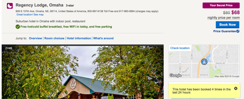
You could argue that they were trying to give me valuable information about how popular that hotel is, but in reality, they were trying to create a false sense of urgency. They wanted me to think that if I didn’t book right at that moment, I was going to miss out. Ticket sales sites that prominently display a countdown timer and shopping sites that tell you “5 other people have this in their cart right now!” are applying the same technique.
No Math, Please
Then there are the sites that use our innate distaste for doing math against us. Any subscription-based site that charges yearly subscription fees but shows you the monthly rate is guilty of this. For example, looking at the screen below, $23.99 per month doesn’t sound like a lot of money, does it? But when a charge of $287.88 hits your credit card, you might be a bit more upset. 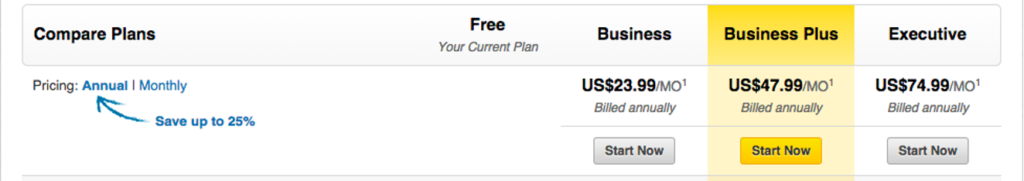
Deliberately Opposite
One of the most common deceptive UX designs is the misuse of web consistency standards to trick you into an unintended action. A few years ago I bought some wallpaper online for my daughter’s bedroom, and soon after, I started getting tons of emails from the site, even though I knew I hadn’t signed up for their newsletter —- but it turns out that I had. This was their newsletter signup option:  Wording something in a negative way, or opposite the pattern that people have come to expect is a deceptive UX design and one that is very easy to get caught in (like I did). Another variant that you’ve probably seen is to use standard wording (e.g. check the box to sign up) with a pre-checked box, but this one was more insidious — the box was unchecked, making me think that I wasn’t opted in and that I didn’t need to do anything. When I realized what happened, I immediately unsubscribed and vowed never to do business with that site again.
Clutter, Clutter Everywhere!
Here’s another one related to newsletters, which uses a deliberately busy design to hide the unsubscribe option. You want to unsubscribe? Go ahead! The option is there… somewhere. 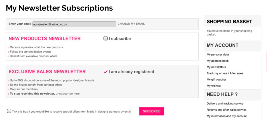
UX designers know that every single onscreen element competes for your attention. So, why is there so much stuff on this unsubscribe page? The designers are deliberately making it harder for you to find the option you want because even though they are legally obligated to have it available, they don’t actually want you to find it.
Passive Aggressive Copy
Here’s a relatively new deceptive UX design that I have been seeing a lot recently:
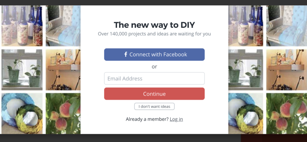
The button to decline the newsletter sign-up says something like, “No thanks, I hate fun” or “I don’t want ideas”. I’ve seen so many variations of this, and it is rather annoying. Yes, I want great ideas, but no I don’t want to be bombarded with emails or to be subtly (or not so subtly) shamed for opting out.
Paid Version as Default
Defaulting to more expensive options or adding extra charges by default is also a deceptive UX design. Over the summer, I was planning to buy bars of shampoo and conditioner from the Grove Collaborative, but when I went to my cart, I discovered that over a dozen other items had been automatically added to my cart and they pushed my total from $23 to over $60!
Needless to say, I abandoned that cart and won’t ever be shopping there! But interestingly, a few hours later, their customer service actually reached out to me via email to encourage me to make the purchase. When I emailed back to tell them that they had added several items to my cart without my permission and explained that this was an unethical design, this was their response:
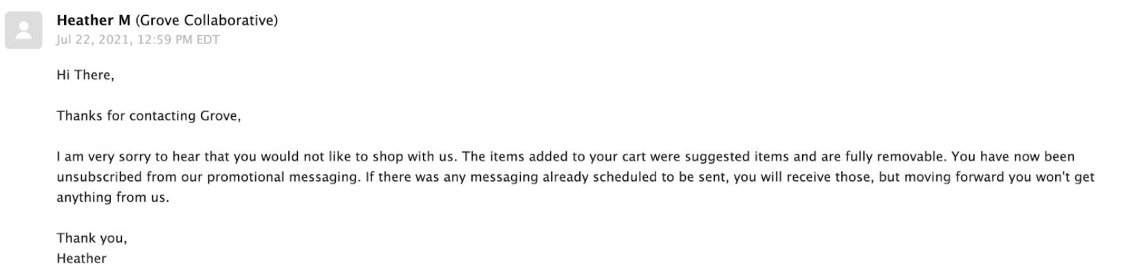
When a company wants to suggest items to you, that’s exactly what they should do — here are some things that we think you might be interested in, add them to your cart if you’d like. They should never be automatically added to your cart, forcing you to take an action (or several actions) to remove them. That would be like some random employee at Target walking up to your shopping cart and dumping a whole bunch of items into it as you were heading to the checkout line!
The Future of Deceptive UX
Unfortunately, these types of unscrupulous designs are getting more creative and harder to spot. The government is taking notice and some companies have had to pay a price for these unethical practices. In 2015, LinkedIn was sued over the use of a deceptive UX design that collected users’ email contacts and ended up settling for $13 million.
But despite these measures, I don’t see the situation getting better—there are simply too many sites to monitor and there will always be unscrupulous people (yes, even unscrupulous designers).
That means that we’re going to have to go on the defensive: making sure that we carefully read everything on the page, rather than assuming we know what those checkbox options say (checked or unchecked); double checking that the only things in the cart are the things that we put there; learning to be a bit more thick-skinned about passive-aggressive text; and watching for other (not-yet-designed) gotchas.
Keep in mind that the best way to discourage these designs is to take your business elsewhere. If you spot a deceptive UX design, just click that little X in the top corner, close the window, and never go back.