
Have you ever picked up an exciting product that at first seemed to be really great and easy to use, and you were giddy like a kid on Christmas morning, but after a while, you just…stopped using it? Why do you suppose that is?
Most likely, you discovered that no matter how pretty and usable it might have been, it just didn’t have the features that you wanted. Or, conversely, maybe it had too many features, making it just a bit more cumbersome than it needed to be.
I guest lecture on the topic of User-Centered Design and Research on a regular basis, and one of the first points that I always try to get across to my audience is the difference between usability and usefulness, and why a user-centered design process must embrace both.
When I introduce the topic and ask what is the end product of user-centered design, the response I most often get is something along the lines of “a product that people can use”. Making a usable product is a cornerstone of user-centered design, but simply making a product usable doesn’t guarantee its success. User-centered design is about making the product that your user needs—and ensuring that the product is not only usable but that it is also useful.
Let me illustrate the difference with an example that nearly everyone is familiar with—highway signs that show you the estimated time it will take you to get to an upcoming destination, shown in the image below.
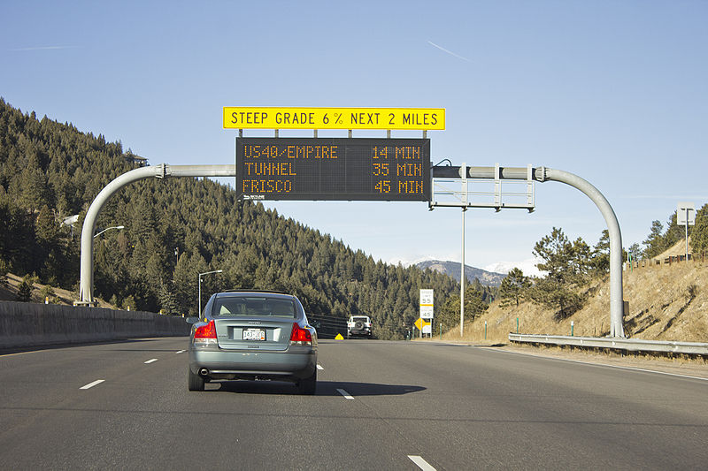
Bidgee, CC BY-SA 3.0 AU, via Wikimedia Commons
The letters on these signs are very large, making them readable from a reasonable distance. They also light up, making them easily readable during both the day and the night. The letters and numbers are nice and crisp, with great legibility. In other words, these signs are extremely usable.
So, when I ask my audience to tell me what is wrong with these perfectly usable signs, pensive silence reigns for several moments. The first several answers are nearly always still focused on usability: you can’t see them if there is a tall truck in front of you; you might misread them if any of the bulbs are burnt out; sometimes they scroll or change to show other information and you may not have had a chance to read the information; they can be obscured by fog.
Eventually, and usually somewhat hesitantly, someone asks “What if I’m not from the area”?
These signs, as pictured, are designed for someone who already knows a key piece of information, a piece of information that renders these signs nearly completely useless if you don’t have it: how far away is that exit? If it’s fifteen miles away, 14 minutes of travel time is great, but if it’s only two miles away you are about to encounter frustratingly heavy traffic. And since these signs are posted on the highway, it is highly likely that many of the intended users are not from the area and are missing that key piece of information.
Einstein is credited with having once said, “If I had an hour to solve a problem, I’d spend 55 minutes thinking about the problem and five minutes thinking about the solution.” If you want to design better products you have to stop jumping into the solution space before you truly understand the problem space; don’t try to solve the problem until you truly understand what the problem is, who you are solving it for, and the obstacles that may be in the way. You have to acknowledge that you do not know everything about your user that may impact your product’s success, and you have to have a willingness to change that, by refining and expanding your understanding.
At Daedalus, our ethnographic researchers are adept at helping our clients to explore and define the problem space, to ensure that any solutions developed are not only usable, but are also useful and desired, and elegantly solve problems and fill needs.
Featured image by Ehimetalor Akhere Unuabona on Unsplash