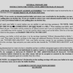
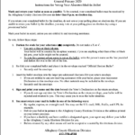
This week, I voted by mail for the first time for the Pennsylvania Primary Election. I’ve always enjoyed voting in person for a variety of reasons, but as a type 1 diabetic in the midst of a pandemic, caution won over. The process of requesting my ballot was pretty simple and easy to do, as was filling out the ballot itself. So I was really surprised and disappointed when I saw how badly designed the instructions were that came with it. (scroll down for an update on this article based on the General Election Ballot instructions)
I’m actively involved in the creation of guidance documents that establish best practices for medical device manufacturers to write instructions for equipment that’s used by patients in their everyday lives. In other words—how to write instructions so that a tween can figure out their insulin pump, a stressed out and exhausted parent can successfully use a SIDS monitor, or a coach can safely use an EpiPen if a player goes into anaphylactic shock. So, I’m sensitive to poorly written instructions and notice these things a bit more.
But still: these instructions were BAD. Let me count the ways:
Incorrect Content
To start off with, the content was … not exactly correct.
The instructions said that I needed to return the ballot in the envelope that was marked “Official Mail In/Absentee Ballot”. But my envelope was labeled “Official Election Ballot.”
The instructions also told me that any ballot received with an unsigned “Elector’s Declaration” on the envelope would be rejected. But there wasn’t an “Elector’s Declaration” on my envelope—there was a “Voter’s Declaration.”
Were either of these errors huge? No, they were relatively minor ones and they didn’t prevent me from voting. They were, however, quite frankly, stupid mistakes that wouldn’t have been made by a good technical writer and mistakes that should have been caught by any decent proofreader. The fact that these minor errors made it to print is emblematic of larger issues such as a lack of care or consideration for the people using this ballot.
Again, these were dumb mistakes that I easily overcame—but how many people might have been thrown off by them?
Complex and Confusing Directions
Beyond the lack of proofreading, the instructions were also badly designed and overly complex.
The average American adult reads at a 9th-grade level. For instructions, most guidelines suggest writing at a 6th- or 7th-grade level to ensure comprehension. What does this mean in practice? It means that sentences should be short, direct, and written in a declarative voice. (Like this one.)
I ran some readability statistics: the mail-in ballot instructions were written at an 11th-grade reading level, and the instructions averaged over 20 words per sentence. They also relied on a lot of passive voice, which is harder to understand, even for native English speakers. And they grouped sentences together in large, hard-to-read blocks of text, which brings us to…
Unfriendly and Inconsistent Formatting
There was no use of white space to help segregate sections. But formatting that made the text harder to read was abundant!
Thirty percent of the text was in bold font face. Thirty percent.
Sixteen percent was in ALL CAPS (which is harder to read than is mixed case), and 9% was underlined.
Apparently, 7% of the text must have been really important because it merited ALL THREE FORMATTING OPTIONS (spoiler alert: that text wasn’t all that important). I’m surprised they didn’t throw in some italics just for the fun of it.
But there’s more! The linear steps to vote and return the ballot—do this, then do this, then do that— were written in paragraph format, as I noted above. When you think of a list of instructions, what do you think of? Perhaps something like this?
- Read the instructions for your mail-in ballot
- Notice how irredeemably bad they are
- Write a blog post about badly designed instructions
Hint: the steps to vote would have been much easier to follow as a list of numbered steps.
The instructions were also fully justified (aligned on both left and right margins)—but left-aligned text is easier to read. And with left-aligned text as the default setting in most word processing programs, that means they chose to make them harder to read.
Accessibility
The font size for the instructions appears to have been an 11-point font but the majority of mail-in voters, at least prior to the pandemic, are older and are more likely to need reading glasses. So, a larger font would have been more appropriate.
And finally, though everything else in that packet was printed on white paper, the instructions were inexplicably printed on colored paper—mine was on gray, and I’ve heard of others that were on blue. Maybe the intention was to draw attention to the instruction paper? But by printing black text on a gray (or blue) background, the contrast between the font and paper was reduced, also making it harder to read, especially for older voters.
In Conclusion…
I’ve argued in the past that not everyone can be a designer. It should be pretty obvious that not everyone can write instructions either. If you want to make sure your product or service—whatever you are writing instructions for— is successful, you must use skilled technical writers.
Here are the instructions that I received, and how I would have rewritten them.
Update for the General Election 2020
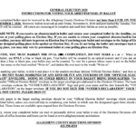
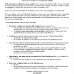
Well, here we are in October. We are still in the midst of a pandemic; so, once again, I opted to vote by mail. I’m pleased to say that some of the issues that I detailed with the Primary Election mail-in ballot instructions have been resolved. They fixed the content that was wrong and the instructions I received were on white paper. But the formatting is still dreadful, and the instructions are not only still complex and confusing … they’ve gotten even worse.
Most perplexing are the two opening sentence of the instructions, the first of which states that my ballot must be received by the Elections Division by 8 P.M. on Election Day (which is a Tuesday). Okay, seems simple enough … except that the second sentence states that as long as my ballot is received by that Friday it will be counted if it was post marked by Election Day. So, Tuesday is the deadline. Nope, wait, Friday is the deadline. Um?
And some of the instructions that were included in the Primary Election Ballot Instructions that seem like they still apply to the General Election Ballot, are no longer included, like how to return your ballot via Fed Ex, DHL, UPS, or Designated Agent, which may be a problem for people with a disability.
Once again, here are the instructions I received, and how I would have rewritten them (using only the content included this time):


