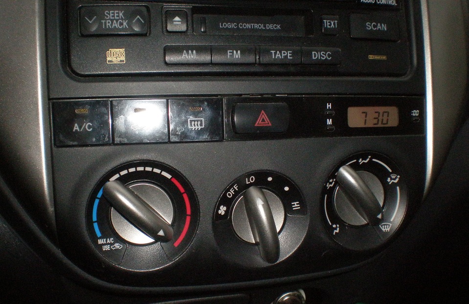
The other afternoon it was quite warm out for the drive home, and once again my husband pointed out that I had my car’s airflow directed only onto the windshield — set during the chilly drive that morning — where it doesn’t do much good in terms of cooling down the car. Though I had adjusted the temperature and the speed of the airflow, I hadn’t changed this.
I explained that I could easily set the temperature and speed of the air without taking my eyes off of the road, but couldn’t with the direction of air. Air temperature and air speed in my car are both controlled by physical knobs that place the extremes on either end. For the temperature, left of center is cold, right of center is warm, with the extremes on either end. For the fan speed, the left-most position is off, the right-most position is high, and anything in between is … well, in between.
But next in line on the dash is the direction of the airflow … whether it’s pointed at the windshield, my face, my feet, or some combination. I have problems setting this one without looking at the knob because the settings are arbitrary: Left = Face, Center = Feet, Right = Windshield, with a few combinations in between.
Not only are the positions of the settings arbitrary, but the icons to illustrate the settings are difficult to see from my vantage point as the driver. Yes, I could memorize the icon positions and adjust the knob by feel according to memory, but I’ve been driving this car for 5 years. If I haven’t memorized them by now, it’s just not going to happen.
You’d never think of asking a driver to look away from the road for safety-critical functions, like steering the car or applying the brake, but somehow it’s considered acceptably safe for other functions like setting the air flow or turning on the rear windshield defroster or setting the radio.
So safe that recent car designs have been moving many of these controls to touch-screen applications, which due to the nature of the touch-screen control requires eyes off the road to operate — at least I can FIND my airflow knob without taking my eyes off the road.
So what happens when these “non-safety-critical controls” do become safety-critical as well? When my windshield suddenly fogs up, I have to be able to quickly turn on the defroster without taking my eyes off the road – which is now harder to see, and because of it, driving requires more concentration. When I approach heavy traffic with the radio blaring and suddenly need to concentrate more on the cars around me, I have to be able to turn my radio off or decrease its volume without taking my eyes off the road.
Recently Consumer Reports reviewed one of the new systems, specifically the MyFord Touch system, pictured above. Here’s an excerpt from their review:
The driver’s interface systems use an 8-inch video touch screen in the center of the dashboard, with a panel of touch-sensitive buttons under it. It also includes two 4.2-inch dashboard displays flanking the speedometer that can be configured to show different gauges and perform some of the same functions as the center screen. Those screens are controlled by two steering-wheel-mounted five-way switches not unlike those found on a television remote or cell phone.
If that sounds confusing, it gets worse: The system also recognizes and responds to voice commands. It all adds up to three or four ways to make what should be simple adjustments. None of the options works as well or is as easy to use as old-fashioned knobs and switches, and they can be more time-consuming and distracting to operate.
Their conclusion was a hope that Ford would return to using tactile controls again. I’d like to second that and expand it to all car manufacturers. When I am behind the wheel, don’t force me to take my eyes off the road or have a conversation with my car to set controls – give me tactile knobs and buttons that function according to standard user conventions. My car may not look as high-tech and stylish, but I’ll be a safer driver.
January 16, 2012 – Just a quick follow-up to the story above — in 2012 Ford is planning to send flash drives to owners of cars with the MyFord Touch system that will be loaded with new software to improve the system:
The visual enhancements to MyFord Touch are based on simplifying the graphics with larger, bolder fonts, removing low-priority visual content, and designing screens based on a consistent pattern. More than 1,000 screens in total have been updated with the improved look.
The news release from Ford goes on to state that the changes will include moving high-frequency controls to be close to the driver’s reach, simplifying tasks, and increasing some font sizes by as much as 40%.
The apparent need for these changes begs the question of what, if any, usability evaluations Ford actually conducted before placing this system in front of people who should be keeping their eyes on the road and their hands on the wheel? Read our recent article on the NTSB Cell Phone Ban for our thoughts on distracted driving.

