The remote was somewhere in the hotel room, maybe buried in the sheets? What I really wanted was that blaring TV off. It was a sleek flat-screen model, with a dark plastic bezel decorated with a fine chrome-look line around the edge. But the “off” button I sought was nowhere I could see. Maybe under the front edge? Nope, nothing but smooth plastic under there. Or maybe it is a touch-sensitive button on the face of that black bezel, like my TV at home? But after enough fumbling, I decided the answer was no. Looking behind the credenza for the power plug, I noticed a series of buttons on the back right side of the upper edge of the bezel, labeled in 8pt type. I pressed one and changed the channel, but the next shut the thing off. At that point, I wondered — when did TV sets become so mysterious? And why are they like this?
My colleague Matt Beale recently related this story and it led to a discussion in our office. Are TV sets and other common devices becoming harder to use? And if so, what’s driving this trend?
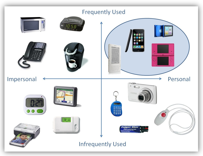
It seems that design has recently been leaning towards a level of intimacy that isn’t necessarily appropriate to the patterns of use that accompany a product. What is “intimacy”? I see it as the interaction between the frequency of use of a product and the personal level of interaction provided by that product.
Highly intimate products are those that you use nearly every day, if not multiple times a day. Compare the use of smartphones and MP3 players to the thermostat that controls your house’s heating and  air conditioning or the clock in your car. While the first set of products might be used every day, the second set might be changed only twice a year.
Yet the “intimacy” of a device cannot be defined by the frequency of use alone. You may use your coffee maker or alarm clock every day, but neither is a highly personal device. Intimacy is also defined by the tendency to keep the device in question close to you at all times. Similarly, you may carry a device with you, such as an emergency alert or a canister of pepper spray, but it is not an intimate device because you will hopefully never need to use it.
Designers of smartphones and similar devices are designing for a very high level of intimacy, and are doing this exceedingly well, creating industrial designs that are sleek and beautiful. However, to accomplish this look, many of these devices are designed without obvious affordances, hiding buttons or omitting labels on controls. This is a perfectly acceptable design for these types of devices, as the user quickly becomes accustomed to the interactions needed to use the device.
But due to the ubiquity of smartphones, designers for other product categories now seem to be convinced that this same sleek look, which lacks these obvious affordances, is needed for their products to succeed. So what happens when the user walks into a hotel room and discovers a TV with no obvious buttons? Or the room’s too cold, but the thermostat controls are obtuse? Or an alarm clock that even Sheldon Cooper couldn’t set.
You might argue that these products were intended for a high frequency of use in a home but were then placed in settings where most of their use is by people who are new to the product, like the hotel room TV example at the beginning of this post. However, as implied above, I do not believe that frequency of use alone should be driving the design decisions that are leading to hidden affordances for these products. I have a TV at home with buttons that are hidden behind the bezel on the lower right side of the screen. The only button that I can use, which I do use several times a week, is the power button, which happens to be the topmost button. When I walk into the room, I usually walk by the TV and run my hand down the side of the bezel until I find the first button; it’s easier than going for the remote if I’m already up and near the TV. But when my family loses the remote, don’t ask me to change the channel. I don’t know which buttons do that, and I don’t want to crane my neck around the side of the TV to figure it out; it’s easier to search for the remote.
You might also argue the designers aren’t at fault, after all the hotel managers allowed themselves to be swayed by the style and the look, not thinking about how frustrating these items might end up being for their guests. I would argue that it is the responsibility of the designer to ensure ease of use in as many use scenarios as possible, and as my own TV demonstrates, even home users may not be garnering the level of satisfaction with these interactions that they should be. That being said, I realize that I am part of the problem. I bought a TV with hidden affordances, in part because it looked good. Next time I’ll know better.
